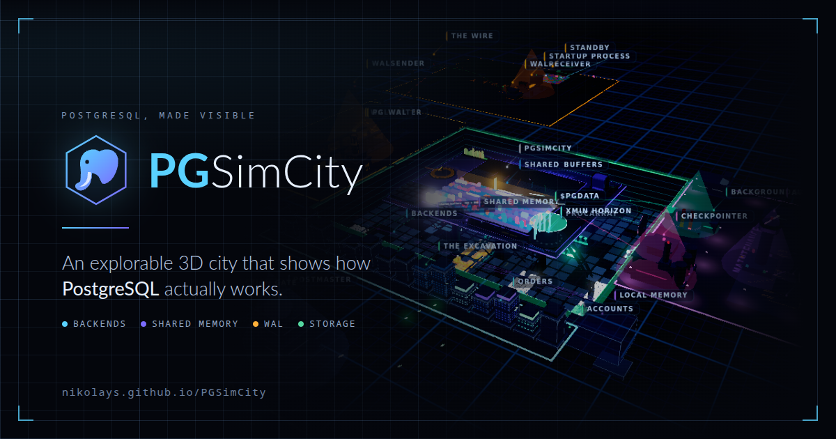
Discussion summary
A discussion about PGSimCity highlights its educational tools and architecture, with users expressing enthusiasm and curiosity.
What the discussion says
- Users find the project impressive and educational.
- Some suggest adding features like TTS to enhance the tour.
- Others compare it favorably to Cities: Skylines II.
“This is amazing!”
“Love this”
Join the discussion
Write your take first — we'll ask for email only when you're ready to publish.
- Hacker News
- I have a pretty good working knowledge of the internals of Postgres, but this just confused me. I think it's too busy to understand. At the very least, it would be cool if there were a "slow down" button.by jedberg
- This is very similar to what I imagine whenever I get into a deep focus state debugging a program in gdb... I would love to experience debugging a program in VR with graphics like this,,, there would be no better way to learn a codebase. I wonder how good an experience you could achieve by generating a 3d map based on arbitrary codeby willquack
- Considering that it has been vibe-coded with not even 48 hours passed: Is this truthful and accurate at all? Or will it lead to false conclusions and anti-knowledge?
- I can't believe "Rendering The First Frame..." is not "Reticulating Splines..." :)
Cool UI.
by arjie - Understanding how scheduling works inside a database used to require numerous architecture diagrams to explain. I was amazed when I saw PGSimCity — it presents such a complex technical implementation process in such an engaging way. Since it's already open‑source, I think the same idea can be reused in other domains, such as cloud computing, Kubernetes, and so on.by Curtis_Guan
- The limiting factor of your human brain is the same limiting factor the reader has to function with. You can get the LLM to aid in making something, but at a certain level of greebling, [0] it just doesn't feel like it's meant to be experienced by another human being, you know? The sacrifices you'd have to make by NOT building this with an LLM would be made because you COULDN'T fit the mental model of everything going on here in your head. The user has got a similar brain with similar limits.
I'm trying to understand the metaphors here, or how all of the animations and flashing lights are meant to represent something going on, but it all sort of gets lost in the sauce. I'm not sure why a new process is represented by a square that goes through a tube and ends up at a building and then the pinball switch glows red. I click on a thing and a popup says "sessions is the victim" with another paragraph of small text, then disappears a couple seconds later? What?
To be fair, I wont assume this is meant to teach me! Always the possibility of a skill issue on my part and I just lack knowledge here. Taking it at face value as a neat thing, it's neat.
by graypegg - I imagined as soon I saw the initial visual that I would somehow be able to enter a query and it would walk me through the flow through the entire system starting from input parsing to all the way to delivering output and perhaps along the way understand some of the autonomous processes that happen in parallel that aren't query specific but run constantly.
What others are saying - fantastic attempt, but don't know where to start or where to end.
by narmiouh - I love what is trying to be done here. Some feedback to improve would be to cut out a lot of the noise with the "Take tour". There are too many boxes and things changing on the screen to get a sense of what is happening. Also make it interactive rather than automatically switch onto the next subject. Being a passive observer to so much information trying to be conveyed is very confusing.
I really do like these kinds of approaches to showing the inner workings of different kinds of tech, so think this is on the good path to being a very useful tool, but needs some focus rather than more data/graphs/info boxes.
by layoric