
Join the discussion
Write your take first — we'll ask for email only when you're ready to publish.
- Hacker News
- Skin is so interesting as a surface to think about how light passes through and bounces off of.
There is at least one article published by a technical artist at Pixar who describes modeling a skull within a human scan so that subsurface lighting is more accurately rendered.
I suspect you could combine this with dr_scully’s comment and GolDDranks’ to reach the nuance involved in long tail realism details.
by bellowsgulch - There's a lot of really good research papers that touch on this area from what I saw - would definitely be cool to see if that extra nuance could be added without dramatically increasing the math complexity; in its current state, the code could be used in any programming language without a library.by automatoney
- I read the “limitations” section’s list of things that affect perceived skin tone and it didn’t mention lighting! This is pretty important as the available light determines the shades that can be perceived.by rebuilder
- The U and V axes seem roughly correspond to the tint/temperature (green-magenta/blue-amber) axes that you can find in a white balance tool in photo editors and also as an in-camera setting.
Nb. I'd advise against calling the PCA'd space XYZ because that's a well known standard color space: https://en.wikipedia.org/wiki/CIE_1931_color_space#CIE_XYZ_c...
by Sharlin - This is super cool! I have always loved projects that try to categorize color space. Usually my work has gone in the other direction - isGray, isCloseToWhite, isPastel - but it's the same insofar as it's defining shapes like your matplot visual.
Wish I had this on hand like this three or four years ago when I was working on VR avatar software - we had hard-coded skin tone options at the time - would have been a cool addition!
by m_w_ - In sharing this around I've found more people than I thought who've done things to semantically chop up the color space - definitely a more interesting area than I first thought of when working on my narrow use case. Feels like it'd be fun to play with something that has a whole bunch of different regions of color space labeled - like "here's where IsPastel overlaps with IsGreen".
But absolutely the hope is that this is a tool that stays accessible to people for whatever they're building and everyone can slow down on reinventing the wheel here for every character creator/digital art application.
by automatoney - I think it’s worthwhile to note this is under a light with a color temperature similar to sunlight.
When you’re actually painting, skin can really be any color. Blue is a perfectly valid (and fairly common) skin color - just look at someone in the moonlight. It takes two to tango, and the other dancer is the light source.
by stu2b50 - Interesting though that the 1.5 setting (at least on my older iPhone) doesn’t really ever seem to cover the range of skin tones of indigenous Australians (“aboriginal” and Torres Strait Islanders), who apparently get their skin tones from a somewhat different expression of genes than other peoples with darker skin.
The 2.0 “outliers” cover those skin tones.
Masai and some Somali skin tones, similarly, look better represented by the outliers.
The full range of possible human skin tones is perhaps a bit of a challenge for technical colour representation, partly because diffuse reflectance seems to vary so much and that is hard to approximate on screen (e.g. as any website designer could attest, the difference between representing silver and grey is the use of highlights), though the representation of skin tones is a lot better than the early colour film era.
by dofm - Yes, 2.0 is the value I tuned the equations around - but I think there's definitely room for improvement in terms of squashing the space along the fair/deep axis in order to get better results at lower R^2.
The issue I ran into was what happens when the space moves beyond RGB, but I think the fix is to just add clamps to the end R, G, B values.
by automatoney - Love it. I especially thought the introspective “aside” section on related resources was great, and I wish more people would show this kind of reflection.by stephantul
- Thanks! I hope to send lots of love those ways, they're basically all things that I found outside of this work that I liked enough to remember (I think Humanae was the one that I found while doing this).by automatoney
- Nice. Most of these colors look right to me, but I'm also seeing green, blue and purple? If you're curating colors from the space manually then it's not a problem.
"Only realistic colors" would be a different problem. And I'm not sure if there's a way to solve that problem without excluding some real colors too.
(Maybe if the colour selector was a different shape? I don't know much about color spaces.)
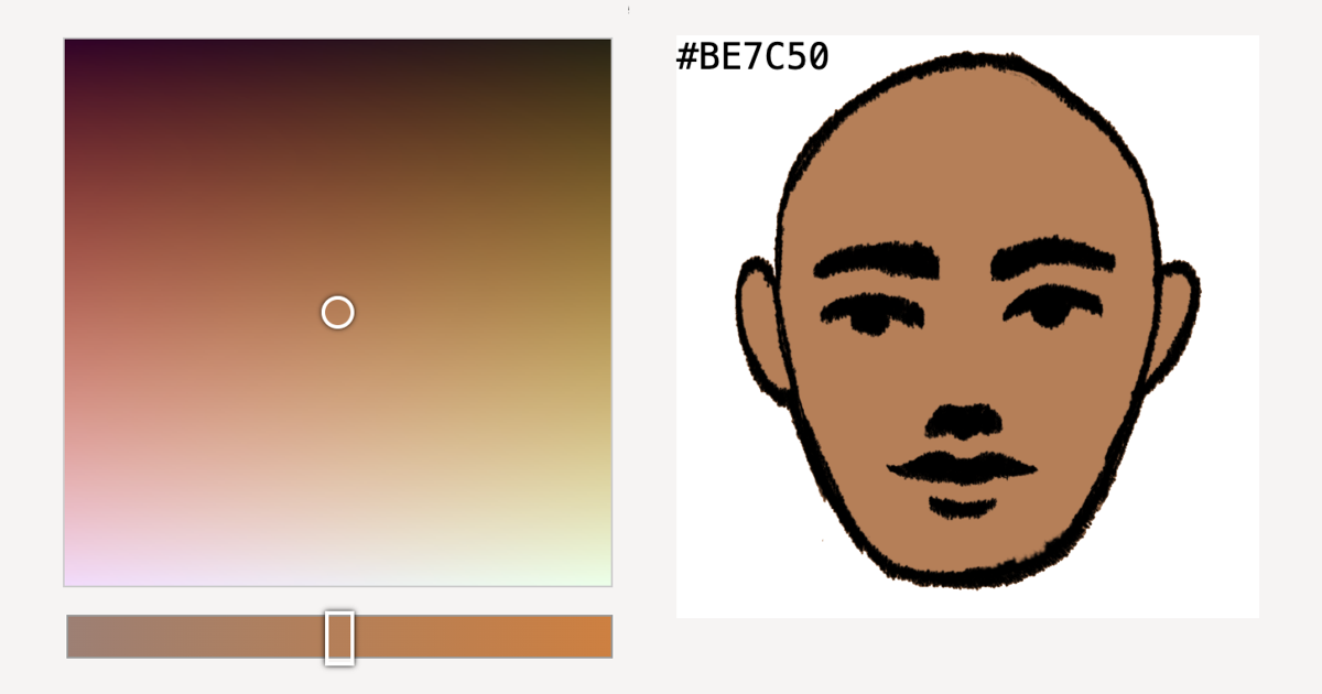
by andai - If you drag the bottom slider all the way to the right you only have plausible skin tones. Drag it all the way to the right and you can match skin tones for orcs, Na'vi and djinnby wongarsu
- Reducing the R^2 value to ~1.5 excludes skin colors that are extremely blue, green and purple. That seems to be a happy medium between including real outliers and excluding colors like green.by richiebful1
- > blue
You'd be surprised: https://en.wikipedia.org/wiki/Argyria
by rsynnott - Yes absolutely right on - I mention much deeper in the page that in a picker UI you can use a bigger range, but that in a generation context you might want to be a bit more selective. I go into it a bit more when I explain what R^2 is.
"not sure if there's a way to solve that problem without excluding some real colors too" - 100% right on that too. A big part of this work was to define a way to tweak/improve the equations in order to approach a solution to these issues - part of my hope in sharing is to get more eyes and brains thinking about this and proposing improvements!
by automatoney - > What colors are we? The short answer is maybe something like “brown” and the long answer is very, very long.
Pete Shirley (author of Ray Tracing In One Weekend) is also a part time color scientist, and he clued me into the fact that if you crank the saturation to 100% of pictures of people of any race, the skin color comes out orange. I think I heard that some face detectors may work on this principle, but I don’t remember where I heard that.
by dahart - and brown is just dark orange.by madcaptenor
- And brown is just orange... with context.by mryingster
- Love it!
I was looking at this a little while ago, and used some of The Pudding's data on makeup/foundation shades (https://pudding.cool/2018/06/makeup-shades/) and plotted it into the Oklab colorspace (https://observablehq.com/@55th/foundation-shades). The shades form themselves into that same crescent as seen in the article.
by mbo - Woah I LOVE both of these! When I get a chance these are 100% getting linked from the writeup.by automatoney
- It's always entertaining to try to understand these things from first principles. Color and skin color in particular are very complex things to measure and model. It's not just a physical quantity, it's also a matter of human perception based on lighting and a host of factors.
It seems like some work was done to research existing approaches, but I don't see any reference to Pantone Skin Tones [0]. Without intending to, I've worked on 3 different projects which involved measuring skin tones for makeup applications. The Pantone range is not 100% perfect, but it's pretty well done and easy to understand. There are two axes: a light/dark one, and red-yellow one [1].
[0] https://www.pantone.com/na/en-us/skintone
[1] https://cosmeticsbusiness.com/pantone-skintone-guide-80945
by s1mon - well its not a free as in beer color spaceby zild3d
- There's also the Monk Skin Tone Scale by Dr. Monk and Google (available under a CC attribution 4.0 international license). It was developed for machine learning, so it's not exactly the same use case, but it provides 10 colors in a variety of formats, including hexadecimal. https://skintone.google/get-startedby ptmkenny
- This is beautiful work! First, I thought this would involve using PCA to go from 3D to 2D, which would result in an easier selector to use, but at the expense of representing every person.
Then, I thought this would stop at using the U-space vectors (the ones that form the basis of the PCA image) and their corresponding ellipse to form our color space, but no, the function fitting is a very slick idea, even if it was executed by hand.
Lastly, I love the presentation of sampling from different r values. Whether you sample from a fixed r value or a range of r values, I bet this has great applications in game design or animation.
I still don't quite get the manual data labeling process at the beginning? It seems like it would encode some bias, but the consistency of the first point cloud and the results certainly speak for themselves.
by vermarish - Thank you! I call out the manual labeling bias and also that a future work improvement would be to be scientific about that labeling process (multiple labelers, expert labelers), and then to feed that into the equation generation steps. Part of where the "good enough" naming comes from - I was hoping that using my art brain and keeping a bunch of reference images in mind (shout out to the Humanae project) would maybe offset the bias a bit. But 100% right on the bias being there.by automatoney
- If you look at my doctoral thesis, in fact skin colour can be parametrised using melanin and haemoglobin concentration; which it means it is indeed (roughly) two dimensional. This allows you to invert the colour of a pixel and identify someone’s chromophore concentration. This is based on previous work of others cited in the thesis.by dr_scully