Join the discussion

Write your take first — we'll ask for email only when you're ready to publish.

  • Hacker News
  • Feels like a mix of Open Sans and Source Sans Pro. These were all over the web about 12 years ago. They got well with Montserrat in all caps and Merriweather: https://www.fubiz.net/

    Whitney was the main font of Stripe when Benjamin De Cock initially redesigned the brand. It was one of the most beautiful websites I'd ever seen (and still is): https://dribbble.com/shots/2974913-Home

    by bbx
  • You cannot be a fancy startup if you don't have your own font I guess.
  • Waste of time and money on their part. There are more than enough typefaces in this world that look just like this one.
  • "Why bother doing something original when there's something generic that's good enough" is certainly one way to approach things.
  • We're apes on a spinning rock... Time and money are both made up, Let the people enjoy their font lol
  • I just bought a Nebula subscription, and hadn't heard of it before, so there's some value there
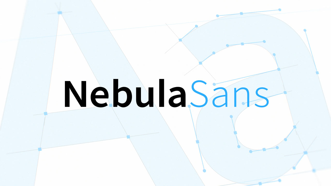
  • According to their website this saved them a lot of money, plus they also made a documentary about making the font which is content for Nebula.
  • In what Universe does worrying about the typeface of your startup effort matter? Google for one has some just lovely free to use high quality typefaces. Do I care about design, hell yes, for one I worked for Adobe helping introduce InDesign, etc. but this makes no sense.
  • Ah, so you are one of the many to blame for InDesign’s many, and I mean MANY, annoyances, weirdness, quirkiness, failures to follow other Adobe app standards and general fuck ups? Good to know.
  • from https://nebula.tv/nebulasans:

    > When Nebula found itself facing exorbitant fees to license the font it relied on for all of its branding, the company decided to find a new font that would work just as well.

  • Which they license for 30 per year?

    EDIT: Now I realize the 30 per year is for a video service.

  • My favorite font of all time is Fira Sans.

    https://fonts.google.com/specimen/Fira+Sans

    Understated yet elegant, you wouldn't immediately notice it is different from your default sans-serif. But it has a soothing regularity that makes it easy to absorb in large quantities and the lowercase g is a quiet encouragement to drink your tea with your pinky raised.

  • Erik Spiekermann is a genius. He made Fira Sans to be a total antithesis to Helvetica. Now, I like Helvetica, but I also love the pure character of Fira Sans and it’s my go-to sans serif.

    Here’s a better link for Fira Sans: https://carrois.com/fira/

    Also, if you have Fira Sans installed on your computer, you can use it in Slack with `/slackfont Fira Sans’

  • I must be the only person in the world that thinks so many of these fonts are casually indistinguishable.

    I feel like I’m reading reviews of wines. This font has chocolatey overtones that bring the reader to a meditative state of hyperflow.

    by y1n0
  • I like this font and the license it comes with:

    > The OFL allows the licensed fonts to be used, studied, modified and redistributed freely as long as they are not sold by themselves. The fonts, including any derivative works, can be bundled, embedded, redistributed and/or sold with any software provided that any reserved names are not used by derivative works.

    Very nice. I’ve paid for fonts for personal use in the past but I was always nervous about accidentally putting a screenshot or other incidental capture somewhere that might get distributed and violate the license.

  • I don't believe they had a choice, since it's a derivative of Adobe's OTF-licensed Source Sans.
  • The SIL Open Font License is pretty much the standard for freely releasing fonts. Poke around on Google Fonts or other places that have freely-licensed fonts and you'll find the vast majority use OFL.

    Adobe's Source (the basis for this one), Google's Roboto and Google Sans, the very common Inter, Lato and Open Sans, coding/monospace fonts like Iosevka, JetBrains Mono... chances are that a free font you're aware of uses the OFL, particularly if it's even vaguely recent.

  • The differences are really, really subtle, I'd bet most people (including me) would have a really hard time telling them apart.

    I agree with that one person (I can't recall when or where I read this) who said modern typography is getting so frivolous about doing personalised typographic families for startups instead of extending the existing ones to cover more languages and scripts than latin.

    But as they say here, "por la plata baila el perro" (something like "a dog would dance for money")

  • I'm not sure we are looking at the same font, this one looks way crispier and more readable than any other font I have ever seen before.
  • para la plata baila el mono -- Wilfrido Vargas 1994
  • “For the money, dances the dog” —Yoda
  • The differences are even subtler if you compare it to Source Sans (which it is derived from) rather than Whitney (which it is replacing). I posted this comparison last time Nebula Sans were on the HN front page: https://imgur.com/JPwgYkj
    by tobr
  • Typography is just a nice geeky topic. Happy for the people who could make Nebula pay them for fussing around with a font. It's clearly bikeshedding and irrelevant though. If their previous font was too expensive, they should have switched to an existing free font. Their priority should be the streaming offerings. When the business isn't working, it's not the furniture that you have to replace.

    I one subscribed to CuriosityStream and Nebula in a combo deal, but didn't end up watching it much. I find them to be overproduced edutainment that's often too plastic for my taste. A kind of Netflix but for IFL science redditor types. I rather prefer low production quality YouTube videos from oddball makers who just show something cool, explain something obscure with a simple slideshow etc.

  • Swear whenever your company decides to invent its own font its like a version of "The Headquarters Curse". You had nothing else better to spend your teams time on so might as well make a new font that 10% of your customers will notice if you are lucky.

    They could have just picked any other font and used it. It's a video streaming website, how much text content is there vs video content?

    Headquarter Curse: A theory suggesting that companies often experience setbacks or decline after constructing a lavish new headquarters.

  • I understand your point, but it does send a message that the company values design and art. It can be a great signal to attract talent. I know I would be!
  • Idk, how much could it cost to design a new font like this? Probably like tens of thousands of dollars?

    This doesn’t seem like an extravagant expense to me. And it sounds like it saves money on commercial font licensing.

  • I think it's important to point out how much easier it is to create a new typeface based on an existing one and using the metrics of another one, than to create one from scratch.

    For example, I've built metrics-compatible versions of Aptos and Verdana in the last few days based on other open-source fonts that matched the shapes closely.

    For Verdana I just told an LLM to add bars to DejaVu Sans and extend some shapes. For Aptos I had to get a bit more creative, designing a new double-storey g, but it was otherwise fine.

  • They could have, but they didn’t. Another way to look at this is they could design their own font, and they did.

    Companies are allowed to make fun things.

  • So, funnily enough in my own career I've experienced The Headquarters event several times, and each time, after the lavish new headquarters is built, I think to myself, "this is it, we've peaked!" and each time it was an inflection point followed by even more growth and success.

    I think I'm at 5 now.

    Also three of those companies designed their own font too, though none of them still use it.