Join the discussion
Write your take first — we'll ask for email only when you're ready to publish.
- Hacker News
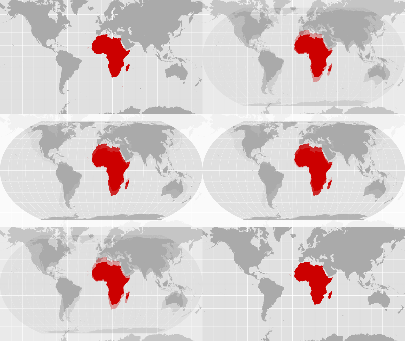
- The old map's Africa looks just like Africa on my globe. I understand that the new Africa is bigger, but it no longer looks like the real shape of Africa on planet Earth.
When I look at a map - political or geographic - my primary observation is the shapes of the nations or landforms. Not the size.
by dotancohen - > In a statement after the vote, Yaryna Ferencevych, deputy U.S. representative to the U.N. Economic and Social Council, accused the United Nations of promoting an ideological agenda and distracting from more pressing issues.
> "Resolutions like this and the ideological agenda they promote, are barnacles on our work here, and the reason this institution is losing its credibility," the statement read.
I dunno, bro, "more accurate map" seems less "ideological" than "refuse to contemplate anything that could be perceived by the most fragile people alive as diminishing the US."
Sometimes it gets harder and harder to understand why certain things trigger these children.
by majormajor - Why don't they use the Mollweide projection instead?by dataflow
- Noted in the linked UN news source:
> Six countries – Estonia, Georgia, Lithuania, Moldova, Serbia and Ukraine – abstained.
It would have been interesting if NPR had covered the diplomatic and economic considerations behind those countries abstaining, and no other right-wing nationalist regime siding with the US.
by bell-cot - by krackers
- I'm neutral on the map. If it makes somebody happy, great.
Would've been a lot more interesting of they promoted a population map: https://ourworldindata.org/world-population-cartogram
by xnx