Join the discussion

Write your take first — we'll ask for email only when you're ready to publish.

  • Hacker News
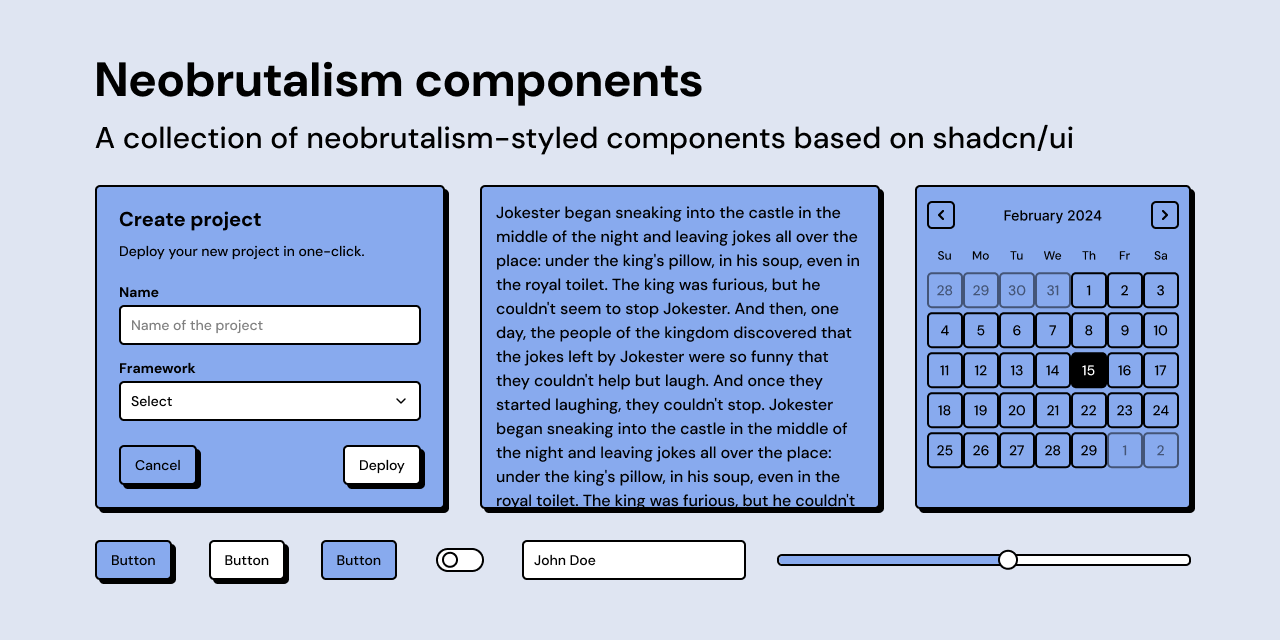
  • looks awful (to provide a genuinely felt counter view)
  • On very spacious and minimalist sites it can be okay, but find this extremely noisy and hard to scan, https://www.neobrutalism.dev/docs/calendar

    I'm normally quite unopinionated on UI styles, but there's something about this style that feels actively hostile to my ability to concentrate on the content. It's not so much that I don't like it, it's just uncomfortable visually to me.

    I assume it's only me, but would be interested if others have the same problem.

  • wonder what a whole page of this looks like, might be a bit much
  • The charts are particularly great.

    I will say I'm afraid to use this style because Gemini seems to love it so much and therefore users will make assumptions about how the website was created.

  • Unless you're building apps for people who are also in tech, your users won't have any idea what UI styles different LLMs push.
  • I'm a big fan of neobrutalist UIs, but I think it's easy to overdo it.

    This component library and the LLM default interpretation of the style is very much "in your face."

    As an example, the black scrollbar here[0] is very heavy, a component which isn't meant to be looked at, but is distracting on first glance.

    Prompting an LLM to make "lightly styled" neobrutalist is much more pleasing to my eyes, but maybe I'm alone in that.

    [0]https://www.neobrutalism.dev/docs

  • Shameless plug for HARDBRUT as well: https://supernihil.github.io/hardbrut/

    Dark/light, accent colors but otherwise no customization. Going after standardized ui. Css blob with builtin font, or no font. Kotlin components as well

  • Is a dark mode available? That's the bit I struggle the most with this style.
  • Not everything should have a dark mode.

    As a style that requires bright contrasting borders and heavy shadows, this is not particularly pleasant as a dark theme. See the “Hardbrut” in dark mode, posted elsewhere in this thread. The white “shadows” are an eye sore.

  • Is there a pure CSS or CSS + JS alternative that does not rely on React?
  • Yeah. Neobrutalism is mostly about the drop shadows + bright color palette. You don't really need a component library for what should be some basic CSS rules.
  • First thing I thought. Tying it to React is a shame.
  • Haven't use it myself, but I've bookmarked https://basecoatui.com/ to try in future.
  • I wish. React + Tailwind as the commonly accepted default is too bad, it sacrifices portability for convenience. It's legacy code in the making, like jQuery and Bootstrap.
  • Doesn't this tell you to stop using this style? It was fresh a few years ago when examples started popping up (Figma) but now Gemini churns it out and there are tons of templates and libraries that use the most common styling. It's not fun when there's a component library and everyone's site looks like it came from the same template.

    Brutalist web design (which is really popular with artists, musicians and designers) is a beautiful style that leaves a lot of room for creativity, whereas this stuff is formulaic garbage.

  • I enjoy the look of these, but personally I wouldn't have thought to describe them as neobrutalist, so I'm thinking I don't know what it is.

    How is brutalism defined in this context? When I think web brutalism I think Craigslist style sites and reduction of superfluous design elements.

  • It's a niche and not super-well defined, but definitely existing style, ie: https://neubrutalism.com/

    Broadly, it's a move away from flat, low contrast Material-type UIs and also away from the 'gradients and curves' AI-era designs and back into something that's more like the early web.

  • I would call this bauhaus not neobrutalism.
  • I think your definition is closer. I would instead look at Bell Kiosk as a good example of someone doing the digital equivalent of brutalism
  • There's two definitions of brutalist web design. https://news.ycombinator.com/item?id=42027654#42028919
  • “neowhimsical” would be a more accurate description. Definitely not “brutalist”, I’m unsure if the founders of this term ever saw anything brutalist.
  • Yeah, I can't stand these influencer-wannabe web-devs misusing terms.

    béton brut means "raw concrete" in French, and in architecture that's what brutalism is. I'd say only sites that look like they use the default style of HTML with no CSS on Netscape 1.x could be called "brutalist"...

    E.g. https://stallman.org

    IMO the design is more "Windows 3.1 Hot Dog Stand Theme" https://blog.codinghorror.com/a-tribute-to-the-windows-31-ho... combined with MS WordArt...

  • …and I thought I was clever when I designed https://poolometer.com to look kind a 1990s summer party / Memphis design
  • Really nice design!
    by slig
  • This is actually "Post-Corporate Memphis". Says me.

    These pages are closer to "neobrutalism" or what I would call "Cybermod" [0], I think...

    <https://webb.page>

    <https://garden.bradwoods.io>

    [0]: <https://news.ycombinator.com/item?id=44415330>

  • Those two websites have nothing in common.

    “Neobrutalism” might be wrong in concept, but it was coined around 2023, that ship has sailed.

  • Post Corporate-Memphis makes sense. Personally it reminds me of vintage Colorforms.

    Maybe also could be described as Post Layervault as I don’t recall a website using so many primary colors and flat shading before they made it cool.

  • This is insanely verbose just for a button with a tooltip:

      import { Button } from "@/components/ui/button"
      import {
        Tooltip,
        TooltipContent,
        TooltipProvider,
        TooltipTrigger,
      } from "@/components/ui/tooltip"
     
      export default function TooltipDemo() {
        return (
          <TooltipProvider>
            <Tooltip>
              <TooltipTrigger render={<Button variant="noShadow" />}>
                Hover
              </TooltipTrigger>
              <TooltipContent>
                <p>Add to library</p>
              </TooltipContent>
            </Tooltip>
          </TooltipProvider>
        )
      }
    
    
    Contrast with plain old HTML form button where the title attribute gives the tooltip text:

      <button type="submit" title="Add to library!">Hover</button>
  • Haven’t you heard that you’re not supposed to type code anymore?
    by sph
  • Yeah but can your tooltip render in neon brown?