Join the discussion
Write your take first — we'll ask for email only when you're ready to publish.
- Hacker News
- I love KDE but they could take some notes from this!by Kuraj
- The only time I think you ever need an icon beside text is if the exact same feature is found elsewhere as an icon only. And even then ask yourself if it can be avoided.by Waterluvian
- 1. Read the post
2. Click on the hamburger menu in the top right
3. ???
by quibono - Humans are very good at distinguishing shapes and colors. Visually distinct icons of various shapes help build muscle memory and quickly find the needed option.
One of the worst trends in icons is this insatiable desire to put different icons into uniform shapes.
For example, this trend resulted in tragic replacement of beautiful varied and distinct Android icons that were introduced in Android 5 to the uglicity we have now.
On iOS, beautiful SFSymbol icons that floated beautifully on flat surfaces since iOS 7.0 were encased in absolutely similar circular 'liquid Glass' blobs. Sad.
- The conclusion is too forgiving...
> They designed it, shipped it, lived with it for a year, then publicly changed their guidance on it. To me, that’s a lot more persuasive than simply saying, “Apple doesn’t do this.”
> Choosing not to do something you’ve never done is one thing.
> Choosing not to do something you’ve done is experience.
A more persuasive sales pitch for me to consider Apple products would be if the company had judgement not to ship such a hot mess of a sloppy product in the first place...
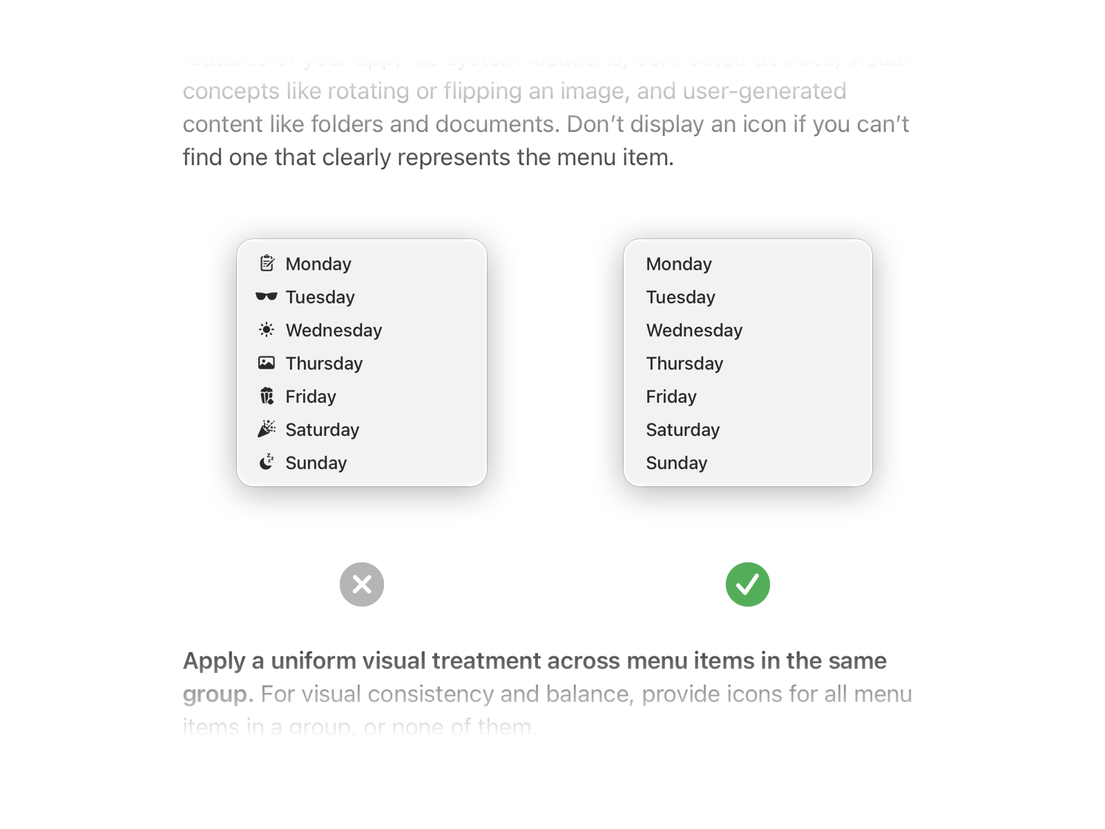
by netsharc - > John Gruber wrote about this reversion back in June, including the fact that Apple’s new Human Interface Guidelines specifically call out Tahoe’s approach to menus as an example of what not to do on macOS.
Apple knew this was bad 20 years ago. They just don't bother to read their own documentation:
Apple Human Interface Guidelines (2008) [1] p. 170:
> If you do include icons in your menus, include them only for menu items for which they add significant value; don’t include them for every menu item. A menu that includes too many icons (or poorly designed ones) can appear cluttered and be hard to read.
- This Apple devotion is really something else..
Looking at all their design missteps and corrections in recent releases my only takeaway is that they are making it up as they go along just like the rest of us.
by paxy - I think this and many other questionable UI decisions across the industry in recent years is the fallout of the old guard of UI designers having rotated out for younger replacements in the past decade with little transfer of knowledge occurring.
The lack of transfer I don't think is out of unwillingness from the old guard, but rather due to the greenhorns throwing everything that came before their time out without questioning the reasoning behind any of it (Chesterton’s Fence) and assuming that whatever they came up with was superior and better fit for the modern era ("those old principles can't possibly hold, we have touch screens now!").
It's also been made worse by UI design roles having been taken by those with backgrounds in unrelated design disciplines, as well as sites like Dribbble which reward pretty mockups over working products. This leads to overemphasis on the visual aspect of the UI and not enough on its functional and usability aspects.